
In this tutorial, we are going to understand the color dodge blending mode. It is the third blend mode listed in the lighten modes category.
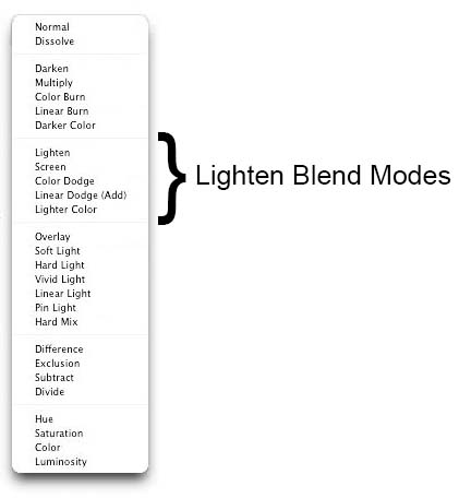
As we already know, each of these modes are categorized and called Lighten because when applied, they lighten or brighten the image to some extent. Each of these blend modes is an exact opposite of the corresponding modes in the darken category. Lighten is the opposite of darken, screen is the opposite of multiply and same way, color dodge is an exact opposite of the color burn mode. When we say opposite, we mean that the final effect of the color dodge mode on an image is the exact opposite of what color burn would have had. An overall opposite effect of all these modes is that each mode in darken category results in darkening of image where the effect of lighten modes is brightening of an image.
To understand the color dodge mode, let us first look at its official definition listed on Photoshop help site.
“Color Dodge looks at the color information in each channel and brightens the base color to reflect the blend color by decreasing contrast between the two. Blending with black produces no change.”
What it necessarily means is that when you change the mode of a layer to color dodge, you are telling Photoshop to blend in its color with the colors of the base layer or in simple words the layer below, then reduce the overall contrast levels in order to brighten the base layer while reflecting the blend color. Important thing to know here is that lighter the blend color is, more significant the color dodge effect will be making the result brighter, with less contrast, and tinted toward the blend color. Black as the blend color produces no change.
The way it works as an opposite of color burn mode is that with color burn, the contrast goes up and image gets darker but with color dodge, contrast levels come down and image gets brighter. Common thing between both these modes is that more significance is given to the colors of the base layer. Let us break it down and understand better with the help of an example.
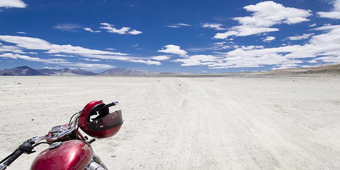
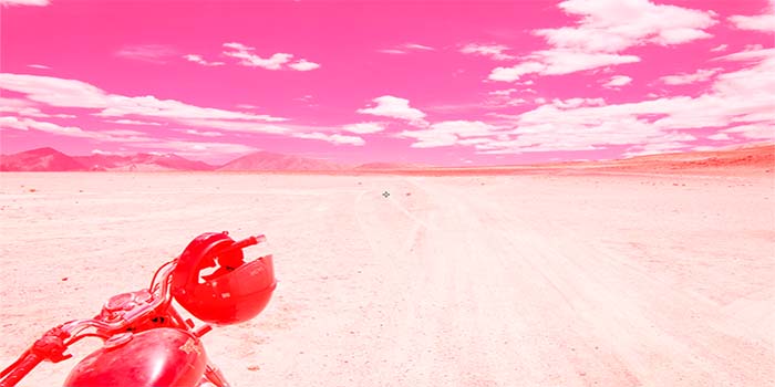
I have the following image open in Photoshop.
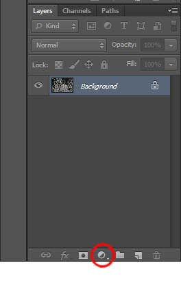
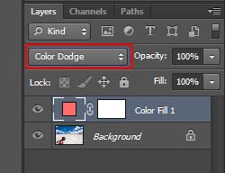
Let us add a solid color fill layer on top of it. Click on “Create a new adjustment layer” icon in the layers panel and select “solid color”.
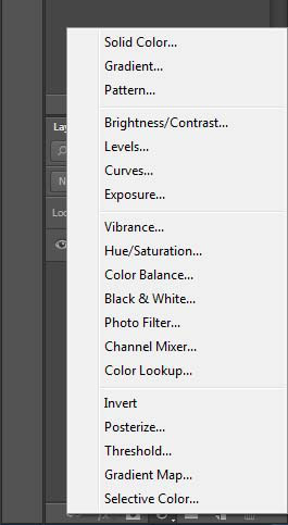
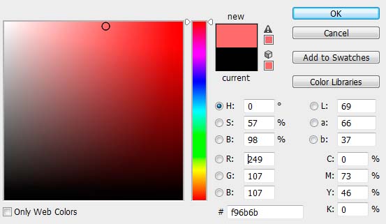
Photoshop will open the color picker box. Let us first chose a light shade of red.
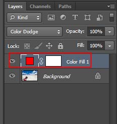
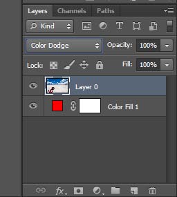
Now we have two layers in the layers panel. Our image sits on the background layer and the color fill layer is on layer 1. I will change the blend mode of Layer 1 to color dodge.
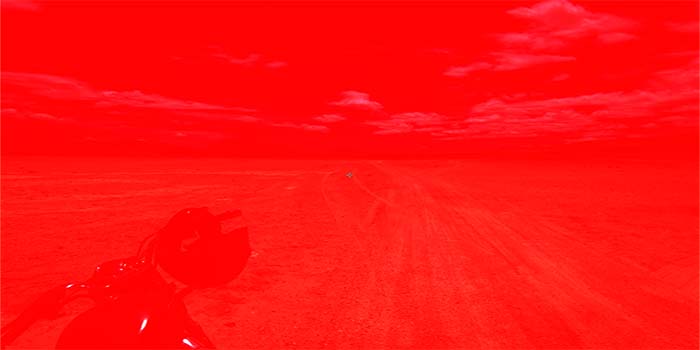
And here is the result.
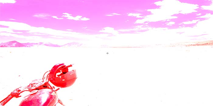
First thing to notice here is that the contrast levels went down and image got brighter. There is almost no contrast in the ground and it all just seems white with a slight red effect. Sky turned from blue to purple after red and blue got mixed. The red of the motorcycle got more prominent as it blended with the red of the image.
I mentioned above that while using the color dodge mode, contrast will be reduced more to brighten the image if the blend color is lighter. Let us see what happens if the blend color is not as light and is of a darker tone.
Repeating the same steps as above, I added a color fill layer on top of the background layer but this time, I chose the darkest shade of red and changed its blend mode to color dodge. Results are somewhat different.
Notice that when we used a darker shade of red, contrast did not get as reduced as it was with a lighter shade. The image also is not as bright as it was before.
Another thing I mentioned above is that color dodge always stresses on the colors of the base layer. So far the image was our base layer and we were blending red into it. But what if red was the base layer and we were blending our image into it. Let us find out. I changed the order of the layers in the layers panel. Now the color fill layer is at the bottom while the image is on top of it. Let us change the blending mode of the image to color dodge.
And this is the result.
Notice how Photoshop stressed on the colors of the base layer. Since our color fill layer was at the bottom and image was blending into it, all we see now is the red with bits and pieces of image into it.
The color burn mode is used sometimes to make tonal and color adjustments to a photo or to create special effects like glows and metallic effects but the truth really is that you would rarely ever touch it for editing images and your day to day work.
Your final take away on color dodge mode is that when you use it, your base layer would lighten up and contrast levels will get reduced depending upon how light or dark the blend color is.