
This tutorial is in continuation with the previous tutorial that covered the color dodge blending mode. Before continuing, I strongly recommend that you go through that tutorial first. However, if you have basic knowledge of adding adjustment layers and changing blend modes, you can continue reading further.
Linear Dodge is another one of the lesser used blend modes of Photoshop. This mode is an exact opposite of the linear burn mode from the darken category. As per the definition listed on Photoshop help site,
“Linear dodge blending mode looks at the color information in each channel and brightens the base color to reflect the blend color by increasing the brightness. Blending with black produces no change.”
In simpler words, what it necessarily means is that when you change the blend mode of a layer to linear dodge, Photoshop will increase the brightness of the layer beneath it and blend in the colors of the upper layer. The lighter the blend color is, more intense the result will be. Blending black will produce no change, black will remain black no matter which layer it is on.
As I mentioned, this mode functions in an exact opposite manner of linear burn mode. While linear burn reduces the brightness to darken the base colors, linear dodge increases the brightness to lighten the base colors. It also works in a similar way to the screen mode but produces a highly intense result. The difference between color dodge and linear dodge is that color dodge reduces the contrast while linear dodge reduces the brightness levels.
Let us take a look at a couple of images. This is the same picture that I used in my previous tutorial covering the color dodge blending mode. Repeating the same steps that we did in the last tutorial, I will add a red solid color fill layer on top of our image to understand how the colors are blending.
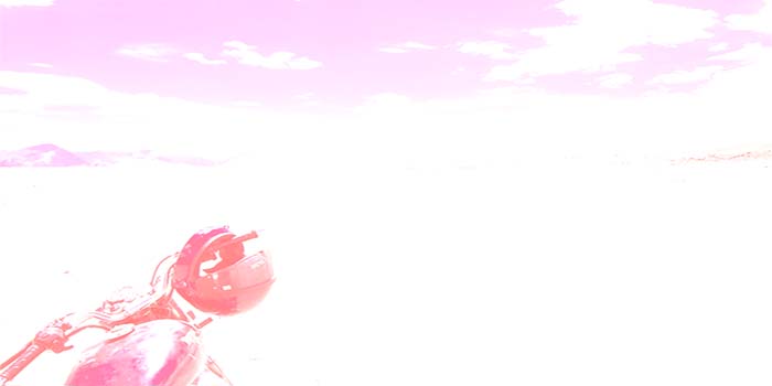
Blend color is a light shade of red
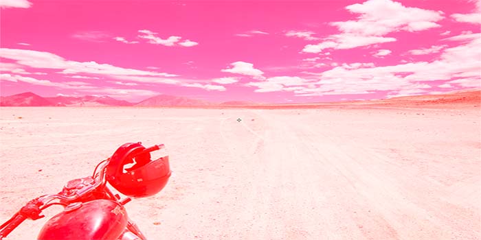
Blend color is a dark shade of red
In the first image, I used a light shade of red to blend in with the base image while in the second image, I used a darker shade. Notice how the base layer brightened up and the blend color turned the blue sky into red. Also, in the first image, with a lighter shade of red, the result brightening of the base layer was way more intense than the second image.